Choosing Colors for Floral Embroidery: Building a Palette
A practical way to pick thread colors for stitched flowers: one main color with a light and dark, quiet greens and a small accent, checked against the fabric before stitching.
Tutorial at a glance
Materials
- Five to seven skeins of six-strand cotton embroidery floss
- A scrap of the project fabric for a test swatch
- Embroidery needle size 7 or 8
A stitched flower can be technically neat and still look flat, and the cause is nearly always color. Thread behaves differently from paint: it cannot be mixed, each stitch is a narrow line, and the fabric shows around all of it. Good floral palettes are therefore small and deliberate. They rely on a handful of skeins chosen as much for how light or dark they are as for their hue.
A simple palette recipe
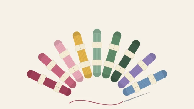
For one design in a 6-inch (15 cm) hoop, five to seven colors of six-strand cotton embroidery floss are enough. Build them in this order.
- Pick the main flower color. For example, a medium rose pink. It covers the most area.
- Add a light and a dark of it. Choose one clearly paler and one clearly deeper version of the same hue. These shade the petals.
- Choose one or two greens. One mid green for leaves, and optionally a darker green for stems and leaf veins.
- Add one accent. A small amount of a contrasting color for centers, buds or tiny filler flowers, such as golden yellow.
- Consider a neutral. White, cream or soft brown rests the eye and is useful for small secondary flowers.
As a rough guide to quantity, let the main color and its light and dark fill most of the flower area, give the greens the next largest share, and keep the accent to a few stitches.
Light, medium and dark: value does the work
Value is how light or dark a color is, regardless of hue. It is what makes a petal look curved. Three values of one color let a petal shade from a dark base to a light tip.
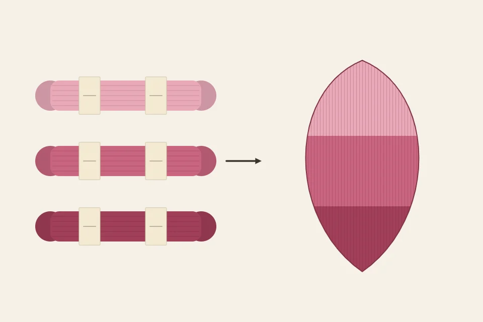
The usual mistake is choosing three shades that are too similar. Differences that are obvious between whole skeins shrink once the thread is reduced to 2 strands on cloth. When shades are arranged in a graded row in the store, skip at least one step between each of your three choices. To check, lay the skeins side by side and squint, or look at them through a phone camera set to black and white. If the three merge into one gray, widen the gap.
Dark at the center fading to light edges gives a cupped, deep flower, as in the stem stitch rose.
Analogous, complementary and monochrome
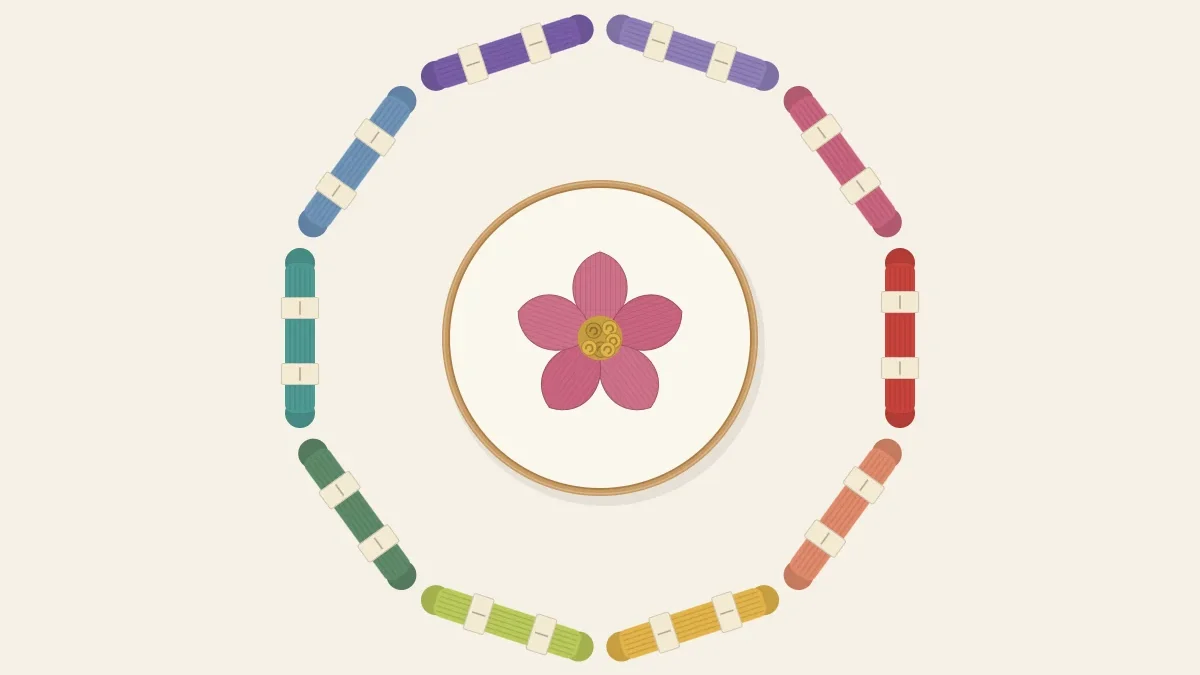
A color wheel arranges hues in a circle: red, orange, yellow, green, blue, violet and back to red. Three relationships on it account for most floral palettes.
| Label | Scheme | How it is built | Example |
|---|---|---|---|
| A | Analogous | Two or three hues that sit next to each other on the wheel | Pinks and corals |
| B | Complementary | Two hues from opposite sides of the wheel | Violet petals with a yellow center |
| C | Monochrome | Light, medium and dark of a single hue | Three blues |
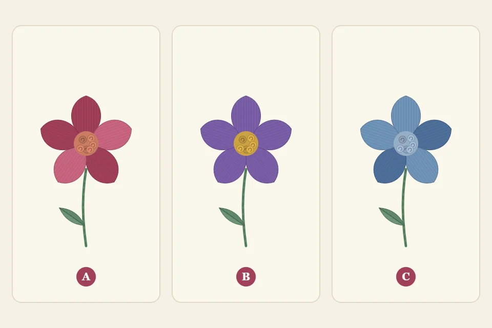
Analogous palettes are the most forgiving, because neighboring hues rarely clash. Their risk is blandness, so make sure the values differ. Complementary pairs (red with green, blue with orange, yellow with violet) intensify each other, which is why a spot of yellow makes violet petals look richer. Let one of the pair dominate and use the other sparingly; equal amounts fight for attention. Monochrome palettes depend entirely on value contrast.
Flowers come with a built-in complementary pair. Pink and red sit opposite green on the wheel, so a rose with leaves is already a high-contrast scheme before any accent is added. That is the reason to keep the greens quiet.
Choosing the greens
Green usually covers more of a floral design than expected, since stems, leaves and sepals add up. Bright, saturated greens compete with the flowers. Muted greens such as sage, olive and gray-green stay in the background and make petal colors look cleaner.
- Warm flowers (yellow, orange, coral, warm red) pair naturally with yellow-leaning greens such as olive and moss.
- Cool flowers (blue, violet, cool pink) pair with blue-leaning greens such as sage and eucalyptus.
- Two greens are better than one. Use the darker one for stems and the leaves that sit behind others, and the lighter one for leaves in front.
Fabric color changes every thread
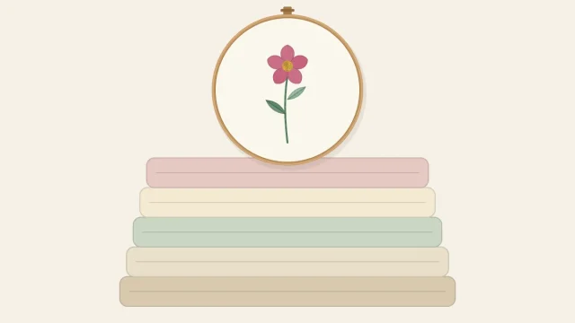
The ground is the largest area of color in the hoop, and it shifts how every thread reads. White fabric makes colors look crisp, but pale tints such as light yellow or blush almost disappear on it; give pale petals a slightly darker outline or move the whole flower one value deeper. Natural, oatmeal-colored linen warms and softens everything, so choose threads a little stronger than seems necessary. On a dark ground the roles flip: light threads glow, dark threads vanish, and the palette’s “dark” should be no deeper than a medium. The practical side of colored grounds is covered in best fabric for embroidery.
Testing colors before stitching
- Lay the skeins on the fabric. Do it in daylight near a window. Lamp light is often yellow and shifts pinks toward orange.
- Step back. View the group from arm’s length, the distance at which a finished hoop is normally seen.
- Remove one skein at a time. If the group looks no worse without a color, leave it out.
- Stitch a swatch. On a scrap of the same fabric, work a few stitches of each color, 1/2 inch (12 mm) long with 2 strands, placing the colors that will touch in the design side by side.
Tip
Write the color numbers beside the swatch in pencil and keep it. If the piece will be rinsed, check deep reds and blues for bleeding first, as explained in the embroidery thread guide.
Common palette problems and fixes
- The flowers look flat. The values are too close. Swap the light for a paler shade or the dark for a deeper one.
- The piece looks busy or harsh. Too many saturated colors are competing. Replace one or two with muted versions, or with a neutral.
- The leaves take over. The green is too bright or too dark for the flowers. Change to a grayer, lighter green.
- The accent looks like a mistake. It appears only once. Repeat it in at least three places, even as single knots.
- One area feels heavy. A strong color is clustered on one side. Spread each color across the design, a principle used throughout the wildflower meadow project.
Frequently asked questions
Do stitched flowers have to match the colors of real flowers?
No. A blue rose or a coral daisy reads as a flower because of its shape. Realistic color matters less than having clear light, medium and dark values and greens that do not compete.
Are variegated threads good for flowers?
They can give gentle shading in a single thread, especially in spiral roses and leaves. The color changes fall where they fall, so use them where exact placement of light and dark does not matter.
What color should flower centers be?
Golden yellow suits most petals, and it is the complement of violet, so it stands out strongly there. Dark brown or near-black centers give weight to yellow, orange and red flowers.
How do I choose colors for white flowers?
Stitch them on a colored ground such as sage or dusty blue, use white for most of each petal, and shade near the center with a pale gray or a pale tint of the fabric color.